| My Pottery Studio - with Easel and Paints! |
![]() |
| Finished Canvas |
| My Pottery Studio - with Easel and Paints! |
![]() |
| Finished Canvas |
To start with I drew a few loose lines across the canvas in charcoal to mark out rough boundaries, but could already notice myself thinking too much about it. So instead I forgot about colours, composition, the ‘correct’ brush to use or any sort of pre-arranged ‘design’ and just grabbed whatever tube of paint seemed nearest – which happened to be Hookers Green. No thought to careful quantities, I just mixed the paints, and then whatever looked like an interesting colour on the palette would end up on the canvas.
It’s good to paint like this for a change: good not to worry about results. In the end I actually quite like the result…but the main object of today was just to paint freely and loosely. It probably helped that the light was running out – no time to think. And choosing colours randomly instead of planning them brought out a few interesting results, especially when I didn’t always clean the brushes properly between application, letting the old colour bleed into the new.
Here’s a list of what I used:
Titanium White, Hookers Green, Cobalt Blue, Ultramarine, Ivory Black, Yellow Ochre, Lemon Yellow and Raw Umber.

Back in February this year I took a trip to Suffolk to visit family. I was brought up in Suffolk so it’s a landscape I’m very familiar with. During my visit I spent some time walking in the countryside taking photographs to use as future reference and inspiration for painting. I decided I’d better use some of this material before winter comes around again! So in the last few days I’ve been working on a new painting inspired by the winter scenery in Suffolk.
I’ve chosen a square format again for this landscape painting and as usual I’m using acrylics on canvas. As you can see from the pictures above I don’t do much preparation. I’ve never really been one for making lots of sketches and plans – I tend to visualize a scene in my head and then go straight to canvas. All I did for this painting was make a very simple sketch in a small notebook to outline the basic composition. This I referred to while I was working to remind me of the plan in my head.
For the colour scheme I chose a limited palette. I’ve also written down which tubes I’ve used to keep a record for future reference. This winter palette is a mix of smoky blue/greys for the distant trees and the road in the foreground, with a very pale washed-out sky. I’ve also chosen a deep purple/brown to imitate the colours found in neatly cropped hedgerows – a feature so typical of modern Suffolk farmland. In contrast I’ve used a vivid, luminous green to highlight the field. I’m hoping this suggests the early growth of a crop and how electric the colour can seem in the midst of winter. A tiny part of me feels I’ve exaggerated this colour just a smidge – but I quite like that!

Anyway, here’s a photo of the finished painting. My experience of looking at it reminds me instantly of the fields and farmland ‘back home’ – this particular field is just 200 yards from my old house! So I’m pleased with the result. The canvas is quite small so I’m thinking I might continue this theme based on Suffolk landscapes on a larger scale: to give myself more room to express those huge open spaces.
Above is a photo of my latest painting, which was inspired by my last blog post. After taking lots of photos of my vases full of flowers I decided I wanted to do a still life painting again. I used to do still life paintings all the time - it was my ‘thing’ in fact: flowers in all sorts of vases and different fruit displays. But more and more I’ve been thinking about using my own ceramics as a starting point for the still life. My first attempt at doing this was back in September last year (see here), but this time I wanted to go a bit further with the idea.
So, I used some fruit I had left in my fruit bowl (which happened to be two more pears again!) and arranged them on my kitchen table in a simple display. Then I added one of my espresso cups in the foreground. I’m a big fan of Bonnard so I suppose the elevated table view – looking down on the display - comes from him. And with no more preparation than a quick sketch directly onto canvas, I set to work.
Overall I’m happy with the result. In fact it’s a picture that works extremely well on the wall rather than in a photo or close-to. This probably seems an odd thing to say, but some pictures come to life once they’re hanging on the wall and slightly elevated. Maybe it’s the angle…? Anyway, it was a strange experience to paint my own pots in such detail – in fact focusing so closely on the espresso cup gave me some new thoughts and insight into making ceramics. So I think this idea is something I’m keen to explore and do more of – especially since it feeds back into both mediums!
Finally here’s a photo montage of a previous photo shoot I took of my espresso cups with fruit from August last year – so somewhere the idea must have been in the back of mind all this time!

I decided to use some material that I’d put together back in January this year. Most of the reference work is photos that were taken over different days and in different weather conditions. The themes I’ve been working on in my recent paintings are simple landscapes of farmland and views across local marshland and rivers. The emphasis is on very simple colour schemes and a build up of layers of landscape; almost like looking at a textile with bands of different fabric. But the overall aim is for a simple naturalism: it has to look realistic at a glance but without too much concern for detail. If that makes sense.
So I chose a small deep edge canvas (20cm x 20cm) for today’s picture and grabbed a couple of old brushes and just went for it. No preparation besides a couple of lines sketched using a piece of charcoal. I find that the less I prepare, the less I ‘worry’ about it or get caught up in unnecessary detail. And apart from a couple of frustrating moments when I had to wipe off some paint where I’d ‘gone wrong’ it was surprisingly relaxing. Much more relaxing than making pots!

Anyway, in these pictures (as you can probably already guess) you can see a composite of the picture being painted in stages and an image of how the painting stands now (at the top). Still not sure if it’s ‘finished’: it will need some time to ‘settle’ in my mind before I know if I’m happy with it. But a nice relaxing day of painting today, which is good.

Long ago (before digital photography!) I used to take 35mm slides of all my paintings. I have a stack of them covering paintings from 1995 onwards. So I thought it would be a simple matter of getting them scanned and loaded onto my new RedBubble account. Well, to cut a long story short (a story that involves two separate scanners, a PC, a Mac, some cables and quite a lot of tea-and-angst) I discovered that while my slides look fab on my old lightbox, most of them really weren’t up to scratch for display on a computer screen - let alone for print. Not even Photoshop could revive them! So unfortunately I haven’t been able to add everything from my back catalogue. A bit disappointing but never mind.
In the past few days though I’ve loaded 24 images – and there’s plenty more to come. I’ll be adding more in the next few weeks and also when I paint something new too. I’ve already had some positive responses from people on the site, which has been really encouraging, although I’ve yet to explore RedBubble properly...there's too much to see!
Anyway, here’s a link to my main profile page on my RedBubble account. And here’s a link to my first journal entry there too – which is why I feel like I’ve written a blog entry already this week!
Most of the images I take these days seem to fall into one of three main categories: pots, paintings and ‘research/resource materials’ for making either pots or paintings. And then in between there’s the occasional picture of someone smiling on a beach! With digital cameras it’s so easy to take 200 or 400 images in one go, which means sometimes I lose track of a batch of images and consequently the ‘plans’ I had for them. One such plan was to start adding my paintings to my Folksy shop. Such an obvious plan! And yet somehow it got waylaid…
Until today. At last I’ve finally listed an original painting in my shop. Above and below are some pictures of it (which, yes, I took today…don’t ask why!) and if you click on the pics they should take you to the listing. This painting is called ‘Three Trees’ and depicts a garden landscape. It’s a small acrylic on a ‘deep edge’ canvas and measures 6 x 6 x 1 ½ inches (15cm x 15cm x 4cm). I’m very fond of this painting – it’s quite restful and understated – and I think it’s a lovely little painting to start off with in my shop. And it seems to go quite well with the pots and cards already in there too!
So I decided to set up a small painting using one of my new canvases; an 8-inch squared ‘deep edge’ canvas. The painting is based on a series of photographs I took at the beginning of January of an open field of grass in front of a farm. The day was divided between rain and sunshine and I tried to illustrate this changeable wintery weather in the painting. In one photograph the sky was quite dark with rain clouds against a bright sunlit farm and field. I’m not sure this is absolutely clear in the painting as it looks quite ‘green and blue’ to me at the moment, when perhaps it should be more ‘green and grey’… so I may have to think about retouching it.

Anyway, I thought I’d put together a little composite of the ‘stages’ this painting went through. It’s quite a simple painting really and I tried to minimise the detail since it’s only small-scale. I’m going to leave it hanging on a wall for a few days so I can catch sight of it during normal day-to-day things. I find this helps me make decisions about whether it ‘works’ or not: whether it needs more work or is in fact ‘finished’.
At last a good day of painting though!
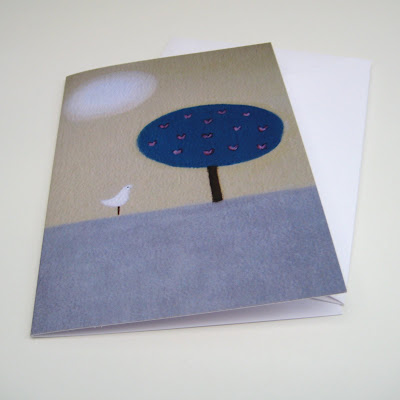
Anyway, I’ve just listed this card on my Folksy shop today so at the moment only this one design is available. But I hope to add more soon.

When you’re feeling cooped up the best thing to do is to get out and blow away some cobwebs. So last Sunday I packed a thermos full of tea, some sandwiches and took a spontaneous bike ride to the beach.
In my last post I mentioned how I was going to focus more on the creative side of things. (Oh yes, and the painting…) That’s all very well of course, but making yourself sit down and ‘be creative’ doesn’t always work. How may times have I sat staring at a blank canvas wondering what on earth to paint? On days like that I find the only way to cultivate ideas and creativity is to take the pressure off and absorb some new surroundings.
And so my ‘inspirational’ bike ride took me to the tiny seaside village of Gurnard. It’s a difficult place to describe. It’s not really a typical seaside place – there’s something a bit special about it. It’s tiny. It has a tiny bay and river with tiny boats and tiny pebble beaches. But what I like most about Gurnard are the groups of higgledy-piggledy wooden beach cabins that sit right along the coast.
What caught my eye about these particular cabins in the photos above is the stretch of open grass in front of them that runs right to the shore. No nonsense holidaying. And from these angles there’s a nice contrast between the flat grey walls of the functional sheds and those little squares of bright green and blue beyond.
Anyway, I quite liked the feel of these photos so in the evening I spent some time cropping and arranging them into composites like this one - which can be a really useful way of exploring possible compositions. Unfortunately I haven’t been able to do anything further with them yet (it’s been a busy week again!) but I hope to get some suitable sized canvases and maybe paint something from them soon.

A couple of weeks ago I found a spare Sunday to paint at last! I decided to spend the day on a simple painting to get back into the swing of things: nothing too complicated or detailed. Still life studies are always useful to get the ideas flowing, especially since they’re easy to set up with anything that happens to be lying around the house. So for a bit of inspiration I chose this little pear sitting on one of my own hand-thrown plain white plates.
After a couple of sketches on paper, I decided to plunge straight into painting on canvas without too much fussing with composition. The canvas is a deep edge 16 x 12 inch. I usually draw a rough outline in charcoal to begin with and then apply a general ‘back colour’ with a big sloshy brush. At this stage I still wasn’t sure what the scheme was going to be, so I just blocked on a base layer using a rough mix of blue cobalt, raw umber and titanium white. I find that blocking the whole canvas with one or two background colours helps to smooth the textured surface which otherwise might show tiny bits of bare white through the painting – it’s so annoying if you miss a bit!

As I got going I realized that my mood was to go VERY simple: not only with the subject (just two pears on a plain white plate), but to be very minimal with the style and colour range too. So the result is quite stylized: an ‘idea’ of a plate and two pears I suppose. It’s quite a calming picture with all that soothing green and because of the large blank, flat areas I think it has an open, spacious feel too. Anyway, I’ve hung it on the wall above the kitchen table for the time being - and it may even turn out to be the beginning of a little series. Here's a close-up cropped shot of the final draft.
I painted this little landscape sketch a couple of weeks ago. It’s only small: just 5 inches by 5 inches on a deep-edge canvas. I’ve done a couple of these very small canvases recently (see here) and I’ve really enjoyed making them. I suppose I’ve enjoyed it because I haven’t had to worry about filling up the canvas – which sometimes feels like a large white and empty desert! Instead I can focus on a simple idea using a very simple colour scheme without fussing too much over the ‘finish’. They take just an hour or so to paint from beginning to end, and I think they work nicely because of this ‘no frills’ feel they seem to have.
This particular one is based on a quick line sketch I made about ten years ago while out walking on the South Downs near Ditchling Beacon. The sketch is also very simple – just three birch trees against a rolling slope on the downs. At the time it was autumn so the tree trunks were a lovely pure white and the leaves were bright yellow/orange against a rainy, grassy green. I’ve been meaning to do something with this sketch for a while, and finally a week or so ago I made this colour ‘doodle’.
The paints I used were very sparse: Hooker’s Green, Yellow Ochre, Ultramarine, Cobalt Blue, Burnt Umber, Titanium White and just a tiny blob of Leaf Green to add a touch of zing to the grass. I quite like the result; which is sort of chunky and loose somehow. I may come back to it and do a more ‘finished’ piece someday – or I may not! In the meantime this little canvas is hanging up in my studio and feels nice and cool and soothing; especially now my studio is getting so hot in the sun!
Yesterday I spent the afternoon painting this small 5 x 5 inch box canvas. That’s about 12.5cm squared in new money. I’ve got a few of these mini canvases lying around and thought it was time to use some of them. At first I wondered if I was going to have trouble painting on such a small scale: I’ve done a few this size before and found it difficult making a composition work in such a confined space. It can also feel like a very cramped way of painting. But since I don’t really have a properly formed idea for anything larger at the moment, I also thought it’d be a nice way of doing some painting without feeling the pressure of having to ‘fill the page’.
The inspiration for this scene came from a bike ride I had a couple of weeks ago on the banks of the River Medina. This is a simplified scene of the opposite bank viewed across the water at about 9am in the morning – so it had a wintery morning feel. There was a patch of lovely green lawns opposite and the colour of them seemed to pick out the wintery, purple foliage. I’m not sure what the title is yet. A Winter’s Morning Across the River…? Although that title seems bigger than the actual picture itself!
Anyway, I enjoyed painting this one: it all seemed to work this time without too much difficulty and I’m pleased with the result (although I may have to tweak a few bits). I used seven different paints in total: Raw Umber, Ultramarine, Yellow Ochre, Hookers Green, Cobalt Blue, Titanium White and just a dash of Black Ivory for a bit of depth. And that was it – all started and finished in one day. It’s good to have days like that.
Since making my teapot I’ve made 4 jars with lids, 4 mugs, 4 salt and pepper bowls, 4 small jugs, 4 large jugs, 2 napkin rings, 2 coasters, 1 incense burner, countless buttons and a small plaque. Some of these are part of an order but the plaque was something I stumbled across when I had a bit of clay left over at the end of the day. Usually I try to use all the clay I’ve prepared during a making session and create a least something however tiny or odd rather than just chucking the leftovers in the reclaim bucket. So I was on the point of making some buttons out of it when instead I decided to do some ‘doodling’.
As is usually the case with these things, I had a huge amount of fun scratching away at the leatherhard clay trying out little designs and re-working them until I finally decided on the ‘tree’ design shown in the photo above. The plaque is only small – not much bigger than a credit card size and deliberately uneven around the edges; in fact it retains the same shape and size of the original piece of clay left over - except for some smoothing. It’s made from stoneware and on the reverse I added a small lug so a piece of wire or twine can be threaded through the hole in the back for hanging.
The design itself is a motif I’ve used before in some of my paintings: and a detail of one example can be seen on the left in the photo above. This painting was from a series of designs inspired by autumn colour – hence the lovely intense orange. It’s a mixed media painting on watercolour grade paper using acrylics and pastels. It’s more of a reference piece rather than a finished work - but the design translates to clay extremely well I think. Of course my next dilemma is how to glaze this piece. Unlike the painting – where the motif and colour are one and the same – I now have to decide whether to glaze in one single colour, letting the motif show through, or follow the motif with coloured glazes. Decisions, decisions.
I’ve been painting all day today in my studio. Above is a photo of my day's work. Not really a ‘finished’ piece of course but a sketch or study I suppose - just to get the ideas going. It’s been a while since I painted anything so I’m a bit rusty - although after about ten minutes I was totally absorbed and almost forgot to have lunch.
I’ve used acrylics on a small 10 x 10 inch canvas, mixing the paints with just a smidge of water now and then if the paint gets too sticky or dry. A limited palette of just nine colours; the main ones being: -
Ultramarine, Cobalt Blue, Raw Umber, Titanium White, Yellow Ochre
Burnt Sienna, Sap Green, Leaf Green, Coeruleum
It’s a view made entirely from memory of the River Medina which I was cycling alongside one day last week in the late afternoon. Of course it isn’t a view of any specific point, but a general ‘mood’ I was trying to capture, particularly the colours at the end of a clear winter’s day about twenty minutes before twilight.